Props
The Wizard component from Wizard of Zod supports several props that control its behavior and appearance. Below, you'll find details on each prop, including types, default values, and descriptions.
Available Props
| Prop Name | Type | Default | Description |
|---|---|---|---|
classes? | WizardClasses | undefined | Used in class bindings that allow for custom Tailwind style overrides. |
customI18n? | CustomI18n | undefined | Use your own custom i18n translations instead of using our default translations. |
forms | Array<Form> | undefined | Otherwise known as steps. 1 form = 1 step. |
initialAnswers? | Record<string, any> | undefined | Pre-populate some or all form fields. |
lang? | 'en' | 'fr' | en | Template boilerplate language. |
layout? | LayoutType | basic | Controls the overall boilerplate layout. |
preview? | PreviewType | cards | Template used to display a summary of form entries before final submission. |
progressIndicator | ProgressIndicator | null | Display an indicator to make the user aware of progress when completing the form. |
classes
| Type | Required? | Default |
|---|---|---|
| WizardClasses | ⛔ No | undefined |
The classes prop allows you to provide your own Tailwind CSS utility-classes to override the defaults we provide.
We provide class hooks on most of the main wrapper containers to allow you to provide your own look and feel.
All our main container wrappers make use of the cn function which allows you to override our default classes.
Example
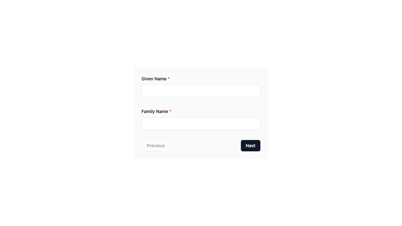
If you wanted to add a background color to the wizard, you could do something like the following:
<Wizard
  :classes="{
    woz: 'w-1/3 bg-[#FAFAFA] dark:bg-gray-900',
    wozForm: 'space-y-8',
    wozPreview: 'gap-4'
  }"
  ...
/>
TIP
For a full list of available class hooks (such as woz above), refer to the WizardClasses interface along with our Layout page.
customI18n
| Type | Required? | Default |
|---|---|---|
| CustomI18n | ⛔ No | undefined |
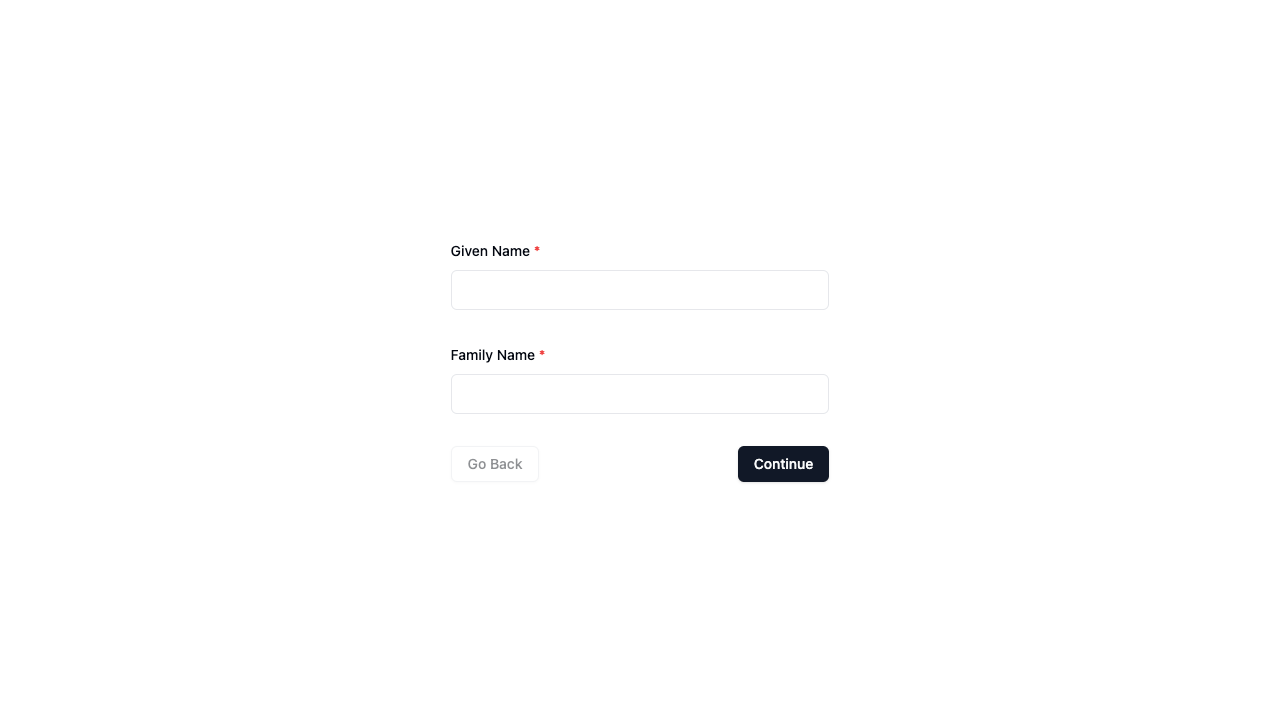
The customI18n prop allows you to override strings of text in the boilerplate.
Example
<Wizard
  :custom-i18n="{
    next: 'Continue',
    previous: 'Go Back'
  }"
  ...
/>
TIP
Refer to the i18n section for a list of strings appearing in the boilerplate - all of which you can override.
forms
| Type | Required? | Default |
|---|---|---|
| Array<Form> | ✅ Yes | undefined |
Arguably the most important of all the props is the forms prop. Not only is it responsible for the number of steps in the Wizard but it also handles input field rendering and validation.
Each Form you provide in this array will be converted to a single step in the Wizard. So if you provide 3 forms in this array, the Wizard will consist of 3 steps.
schema
The schema is where the magic happens. Pass a Zod schema and watch as the AutoForm component from shadcn-vue.com automatically renders the most appropriate field (or multiple fields) to collect input from the user for that step.
The following table shows the mapping of Zod schemas to rendered shadcn-vue.com components.
| Zod Schema | Shadcn-vue.com Component |
|---|---|
| boolean | Checkbox or Switch |
| number | NumberField |
| string | Input or Textarea |
| file | File Input |
| date | Datepicker |
| enum | Select or Radio Group |
You can also provide a custom component of your own for any schema. Learn more about this on the shadcn-vue.com AutoForm component docs.
Example
<script setup lang="ts">

// ...

const forms: Form<z.ZodObject<any>>[] = [
  {
    schema: z.object({
      givenName: z.string().min(2),
      familyName: z.string()
    })
  },
  {
    schema: z.object({
      gender: z.enum(['male', 'female'])
    })
  },
  {
    schema: z.object({
      age: z.number()
    })
  },
]

// ...

</script>

<template>
  <Wizard
    :forms="forms"
  />
</template>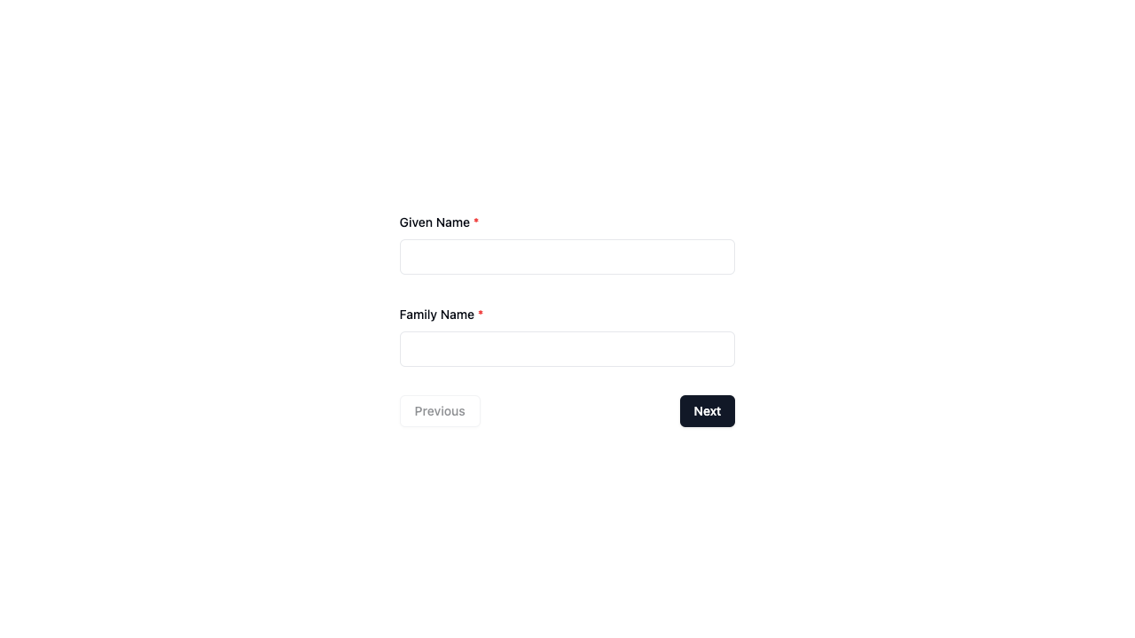
fieldConfig optional
As Zod doesn't allow adding other properties to the schema, you can use the fieldConfig prop to add additional configuration for the UI of each field.
For example, if you wanted to set a placeholder on a text field you would do the following:
<script lang="ts" setup>
// ...

const forms: Form<z.ZodObject<any>>[] = [
  {
    schema: z.object({
      givenName: z.string().min(2),
      familyName: z.string()
    }),
    fieldConfig: {
      givenName: {
        inputProps: {
          placeholder: 'e.g. - John'
        }
      },
      familyName: {
        inputProps: {
          disabled: true
        }
      }
    }
  },
  {
    schema: z.object({
      gender: z.enum(['male', 'female'])
    })
  }
]
</script>

<template>
  <Wizard
    :forms="forms"
  />
</template>
You can use the inputProps property to pass props to the input component. You can use any props (attributes) that the HTML component accepts.
title optional
When an optional title (string) is provided in a Form, a <h1> title will be displayed above that form.
description optional
When an optional description (string) is provided in a Form, a <p> paragraph will be displayed above that form - following the title (above) if it has also been provided.
Example
<script lang="ts" setup>
// ...

const forms: Form<z.ZodObject<any>>[] = [
  {
    schema: z.object({
      givenName: z.string().min(2),
      familyName: z.string()
    }),
    title: 'Personal Details',
    description: 'We collect your personal details so we know how to address you.'
  },
  {
    schema: z.object({
      gender: z.enum(['male', 'female'])
    })
  },
  {
    schema: z.object({
      age: z.number()
    })
  },
]
</script>

<template>
  <Wizard
    :forms="forms"
  />
</template>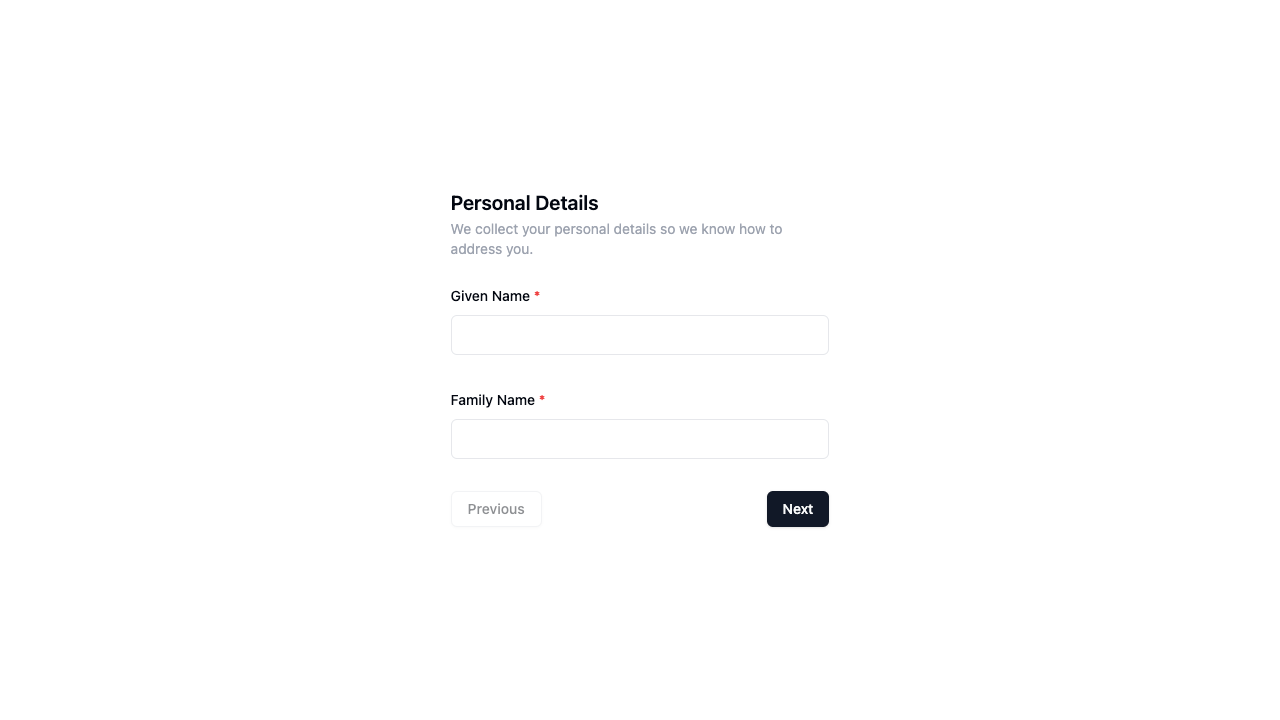
initialAnswers
| Type | Required? | Default |
|---|---|---|
| Record<string, any> | ⛔ No | undefined |
Pass in the initialAnswers if you would like to pre-populate any field in your forms.
Example
<Wizard
  :initial-answers="{
    givenName: 'John',
    familyName: 'Doe'
  }"
  ...
/>
lang
| Type | Required? | Default |
|---|---|---|
| 'en' | 'fr' | ⛔ No | 'en' |
The lang prop sets the language of the boilerplate.
<script lang="ts" setup>
// ...

const forms: Form<z.ZodObject<any>>[] = [
  {
    schema: z.object({
      givenName: z.string().min(2).describe('Prénom'),
      familyName: z.string().describe('Nom de famille')
    }),
  },
  {
    schema: z.object({
      gender: z.enum(['male', 'female']).describe('Genre')
    })
  },
  {
    schema: z.object({
      age: z.number().describe('Âge')
    })
  },
]
</script>

<template>
  <Wizard
    lang="fr"
  />
</template>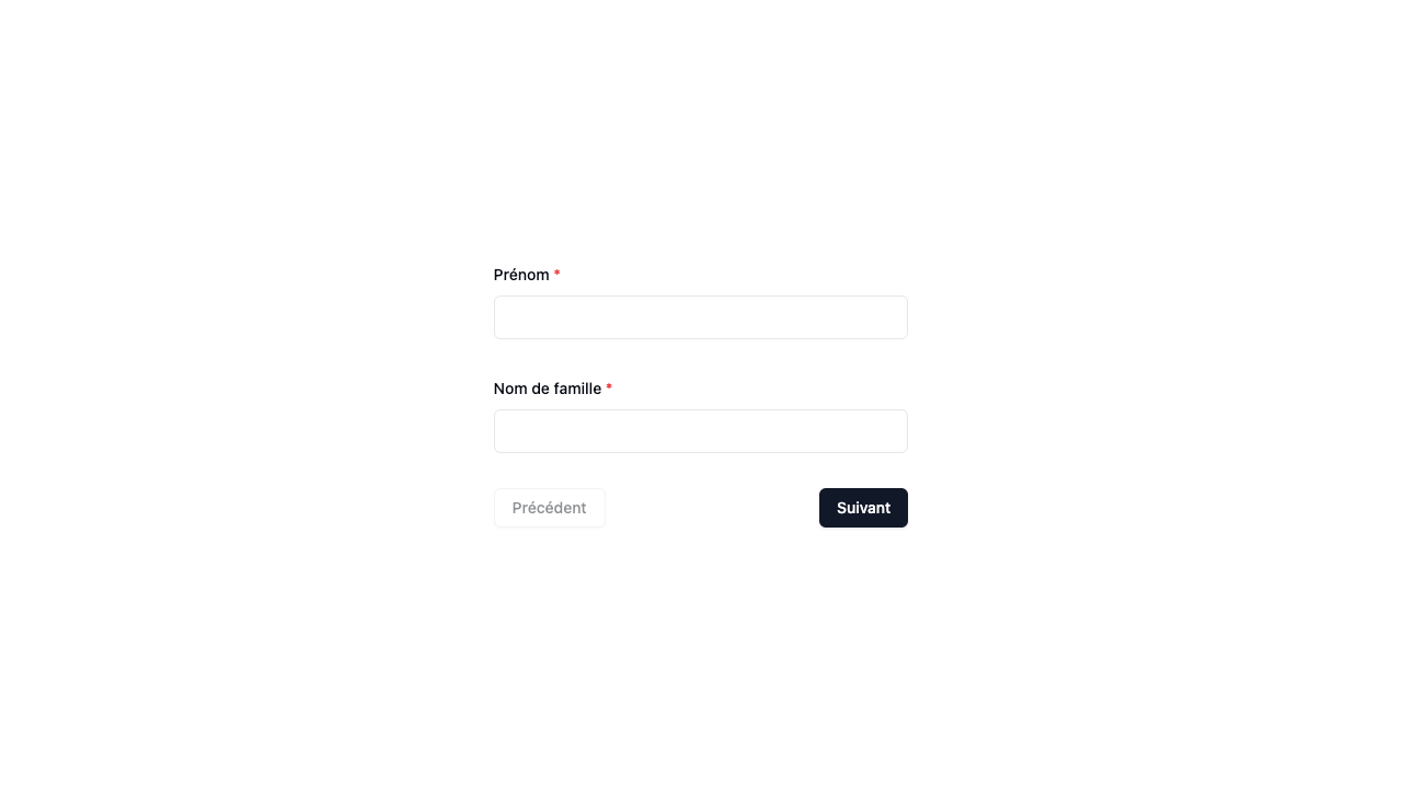
TIP
You might notice that the form labels above (not just boilerplate buttons) are also translated. Learn how to do this in the i18n guide.
layout
| Type | Required? | Default |
|---|---|---|
| LayoutType | ⛔ No | 'basic' |
Controls the overall boilerplate layout. See the layout guide to learn more.
<template>
  <div class="h-screen flex justify-center items-center">
    <Wizard
      :classes="{
        woz: 'w-full',
        wozBody: 'xl:w-1/4',
        wozForm: 'space-y-8',
        wozPreview: 'gap-4'
      }"
      layout="default"
      ...
    />
  </div>
</template>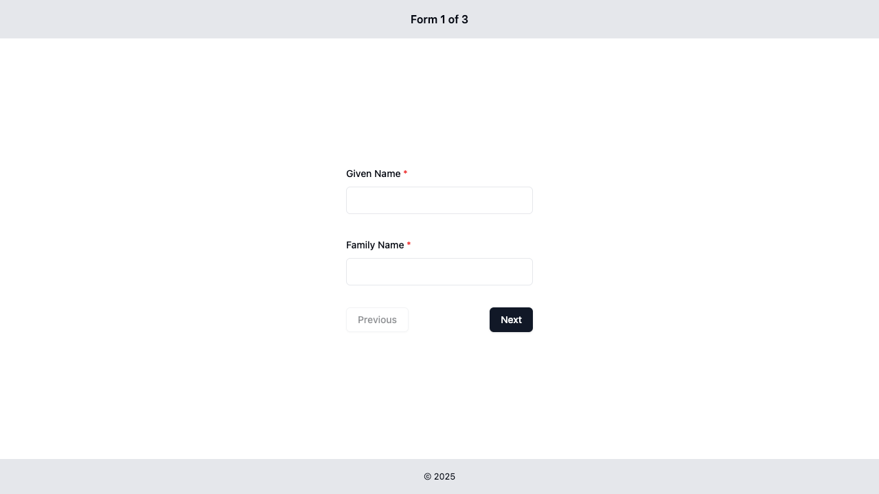
preview
| Type | Required? | Default |
|---|---|---|
| PreviewType | ⛔ No | 'cards' |
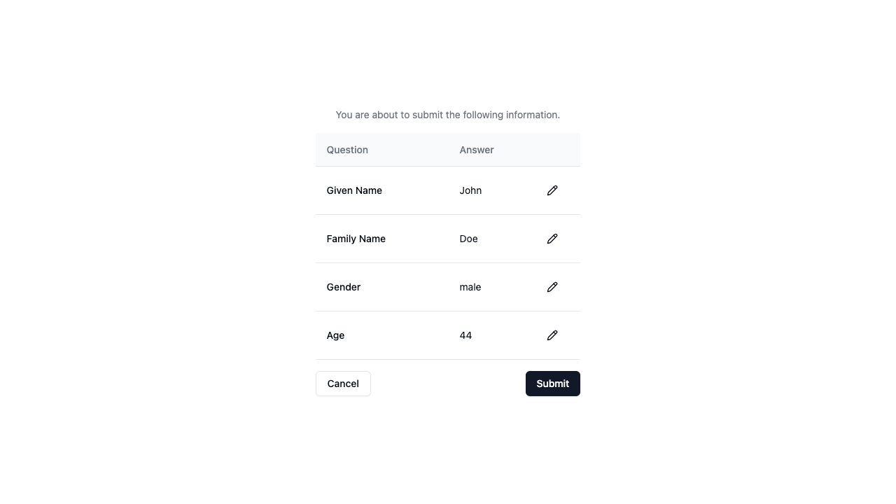
When a user clicks the submit button on the last step in the wizard, they are then shown a preview of all data they have entered. This gives them an opportunity to make any corrections if required before the finally submit their answers.
See the preview guide to learn more.
<Wizard
  preview="table"
  ...
/>
progressIndicator
| Type | Required? | Default |
|---|---|---|
| ProgressIndicator | ⛔ No | null |
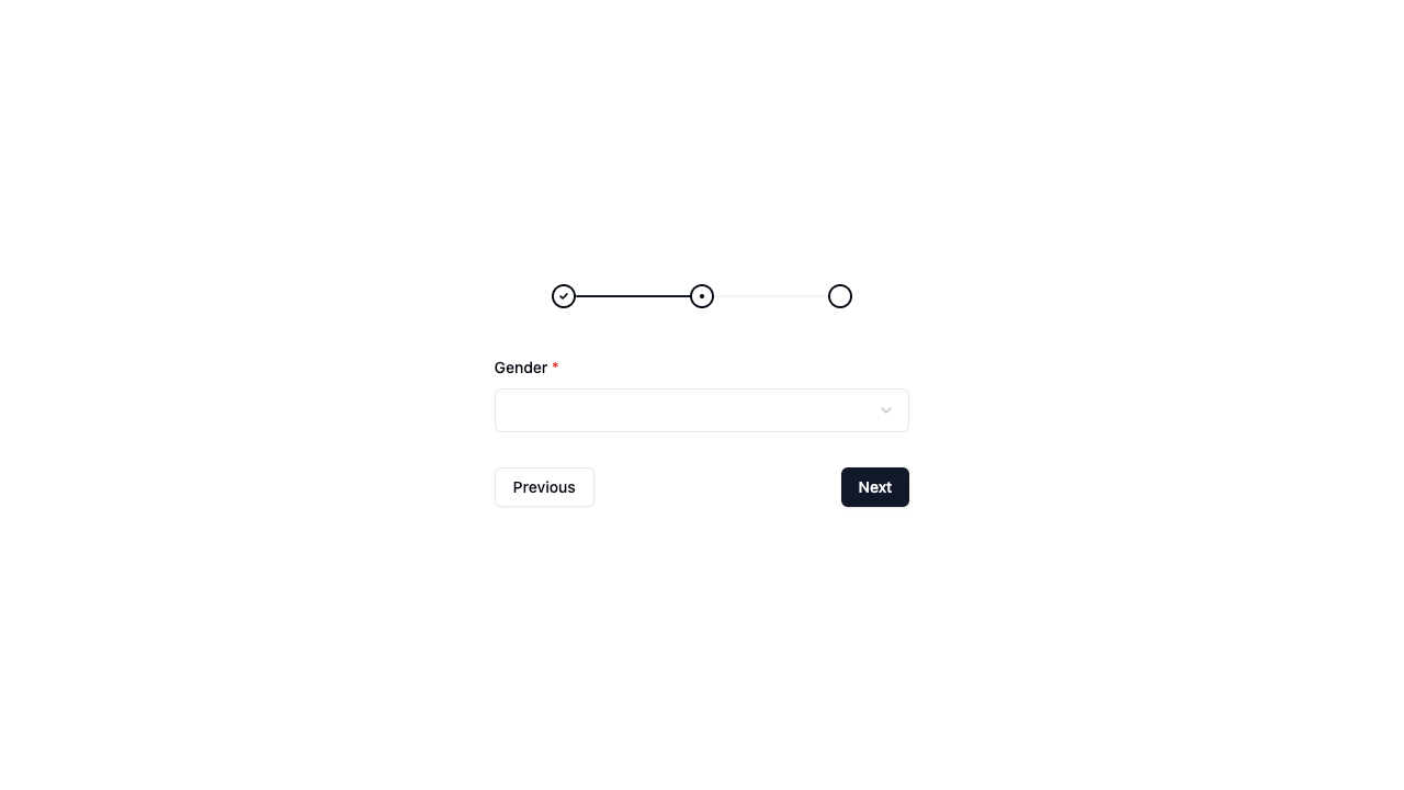
Particularly useful for wizards with many steps, a progress indicator allows the user to keep track of their progress through your forms.
See the progress indicator guide to learn more.
<Wizard
  :classes="{
    woz: 'w-1/3',
    wozBody: 'flex-col-reverse',
    wozForm: 'space-y-8',
    wozPreview: 'gap-4'
  }"
  progress-indicator="stepper"
  ...
/>
TIP
By default, progress indicators are shown below the form. Notice how in the above example it was positioned above the form with the wozBody: 'flex-col-reverse' definition in the classes prop.