Preview
Overview
After completing all forms and ensuring all fields are valid, users are presented with a Preview screen. This allows them to review their inputs and make any necessary amendments before final submission.
Choosing a Preview Type
The wizard supports a configurable preview prop, which determines how the preview is displayed. The available options are:
| Option | Description |
|---|---|
'cards' | Displays preview data in a card-based layout (default). |
'list' | Shows preview data in a simple list format. |
'table' | Structures preview data in a tabular format for a more structured view. |
Cards Preview default
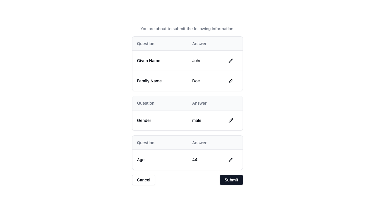
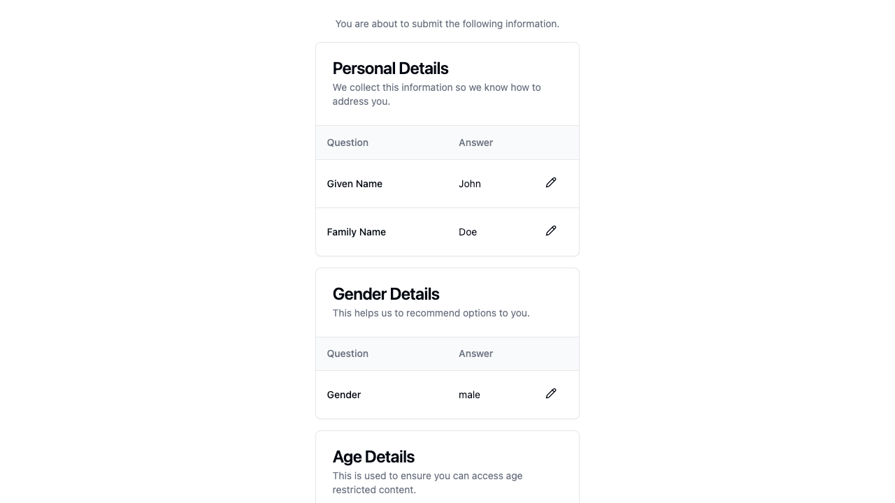
The cards preview displays each form’s data in a separate card with structured content. Users can see their answers grouped neatly with optional titles and descriptions.
<Wizard preview="cards" />Without Form.title and Form.description:

With Form.title and Form.description:

List Preview
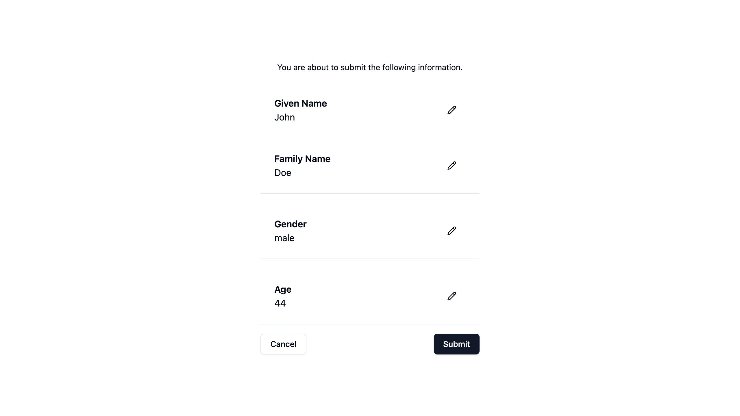
The list preview presents each question and answer in a straightforward, readable format. It is useful for minimalistic designs where compactness is preferred.
<Wizard preview="list" />
Table Preview
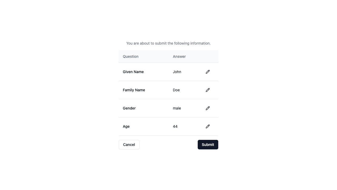
The table preview organizes form data into a structured table layout, making it easier to scan large amounts of information at a glance.
<Wizard preview="table" />
Conclusion
The preview prop provides flexibility in presenting user-entered data before final submission. Whether using the default cards, list, or table preview, Wizard of Zod ensures a seamless review process before submission.