Styling
Overview
By default, Wizard of Zod comes with a clean and polished UI, thanks to Tailwind CSS and shadcn-vue components. However, we understand that every project has unique styling needs. To provide flexibility, we offer a classes prop that allows developers to customize various parts of the wizard using Tailwind utility classes.
Customizing Styles with classes Prop
The classes prop is an object that allows you to override default styles by providing your own Tailwind utility classes. This gives you full control over the look and feel of the wizard.
Example Usage
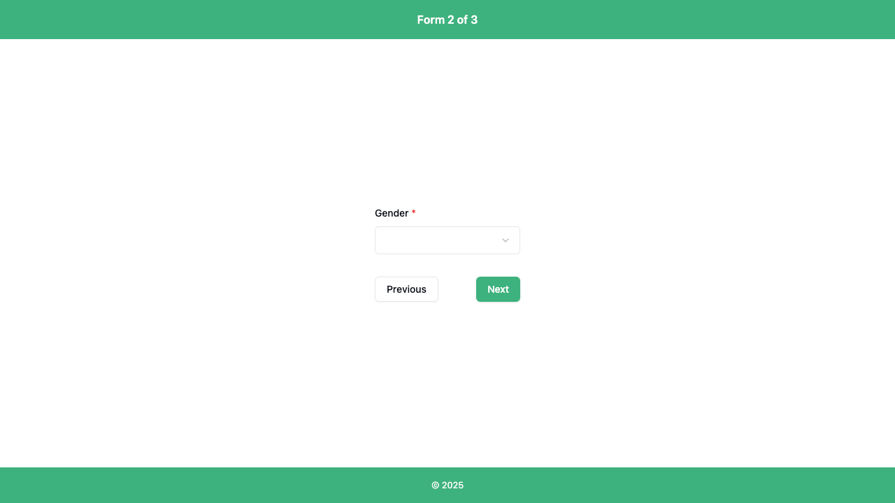
To customize the wizard header, footer and next button for example, you can pass a classes object like this:
<Wizard
  :classes="{
    woz: 'w-full',
    wozForm: 'space-y-8',
    wozHeader: 'bg-[#3EB27F] text-white',
    wozFooter: 'bg-[#3EB27F] text-white',
    wozFormButtonNext: 'bg-[#3EB27F] text-white',
  }"
  layout="default"
  ...
/>
See the WizardClasses interface for the shape of this prop.
Each property (or what I like to call a styling hook) corresponds to a specific part of the wizard, allowing you to fine-tune its appearance.
Breakdown of Styling Hooks
| Property | Description |
|---|---|
woz | Root container styling |
wozHeader | Styling for the wizard header |
wozBody | Main body of the wizard |
wozFormStepper | Step indicator styling |
wozFormIntro | Introduction section before form steps begin |
wozForm | Styling for the form container |
wozFormButtons | Container for the navigation buttons |
wozFormButtonPrevious | Previous button styling |
wozFormButtonNext | Next button styling |
wozProgress | Progress indicator styling |
wozPreview | Preview step styling |
wozPreviewIntro | Intro text for the preview step |
wozFooter | Footer styling |
TIP
Have a look at the layout section to help you visualise where these styling hooks are used.
How It Works Under the Hood
Internally, Wizard of Zod applies the provided classes using the cn utility function, ensuring a seamless merge of default styles with user-defined ones. Here's an example of how the wozFooter class is applied within the LayoutDefault template:
<div
id="woz-footer"
:class="cn('bg-gray-200 w-full p-4 flex justify-center', classes?.wozFooter)"
>
<small>© {{ year }}</small>
</div>Explanation
- The
cnfunction merges the default Tailwind CSS classes with any user-supplied class fromclasses?.wozFooter. - If no custom class is provided, the default styles ensure a clean and responsive footer.
- This approach maintains the integrity of the component while allowing for easy overrides.
This pattern is repeated throughout the component, allowing each section to be customized via the classes prop.
Advanced Customization
If you need deeper customization, you can combine this with Tailwind CSS features like @apply in your CSS:
.custom-stepper {
  @apply flex justify-between items-center text-sm text-gray-700;
}
Then apply it in the component:
<Wizard
  :classes="{
    wozFormStepper: 'custom-stepper'
  }"
/>
Conclusion
With the classes prop, you can easily adapt Wizard of Zod to fit your design system while leveraging the power of Tailwind CSS. Whether you need minor tweaks or a completely new look, this flexible approach allows seamless styling customization.