Introduction
Wizard of Zod is a Vue component that makes rendering and collecting data from step by step forms easy to implement in any Vue project.
TIP
Just want to try it out? Skip to the QuickStart.
Motivation
Wizard of Zod was created out of the frustration with the time-consuming task of having to manually create step by step forms for use in touch screen kiosks, websites and other software.
As a developer, I just wanted to provide a simple schema which would automatically handle form rendering and validation with the end result of collecting well-formed valid data from the user as I expected.
Behind The Curtain
The eureka moment came when I stumbled upon shadcn-vue.com and particularly their excellent AutoForm component which does most of the magic by taking a Zod schema rendering it as a form and handling validation. Exceptional!
The following table shows the mapping of Zod schemas to rendered shadcn-vue.com components.
| Zod Schema | Shadcn-vue.com Component |
|---|---|
| boolean | Checkbox or Switch |
| number | NumberField |
| string | Input or Textarea |
| file | File Input |
| date | Datepicker |
| enum | Select or Radio Group |
You can also provide a custom component of your own for any schema. Read more about that over at shadcn-vue.com.
TIP
If you're new to Zod, it might seem daunting at first but trust me - once you get it you won't want to handle validation any other way!
A Simple Example
Simply provide an array of Zod Schemas (which will be treated as individual forms) and Wizard of Zod will present them as a step-by-step form wizard... hence the name "Wizard of Zod"!
Code
This example presents a form wizard with 3 steps (forms).
<script setup lang='ts'>
  import { z } from 'zod'
  import Wizard, { type Form } from 'wizard-of-zod'

  const forms: Form<z.ZodObject<any>>[] = [
    {
      schema: z.object({
        givenName: z.string().min(2),
        familyName: z.string()
      })
    },
    {
      schema: z.object({
        gender: z.enum(['male', 'female'])
      })
    },
    {
      schema: z.object({
        age: z.number()
      })
    },
  ]

  const handleCompleted = (data: Record<string, any>) => {
    console.log(data)
  }
</script>

<template>
  <div class="h-screen flex justify-center items-center">
    <Wizard
      :classes="{
        woz: 'w-1/3',
        wozForm: 'space-y-8',
        wozPreview: 'gap-4'
      }"
      :forms="forms"
      preview="list"
      @completed="handleCompleted"
    />
  </div>
</template>
I just added some classes here for demonstration purposes. You can add your own or completely omit them.
Resulting Screenshots
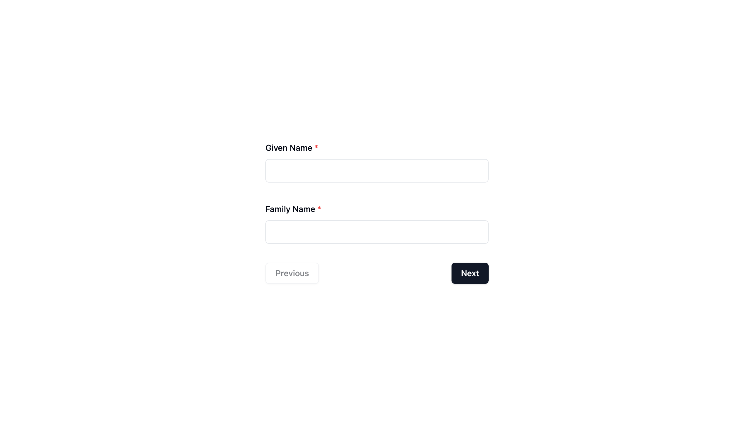
Step 1
The first form contains a Zod schema with two string fields so two text input fields are rendered.
Notice that on the first step, the Previous button is disabled.

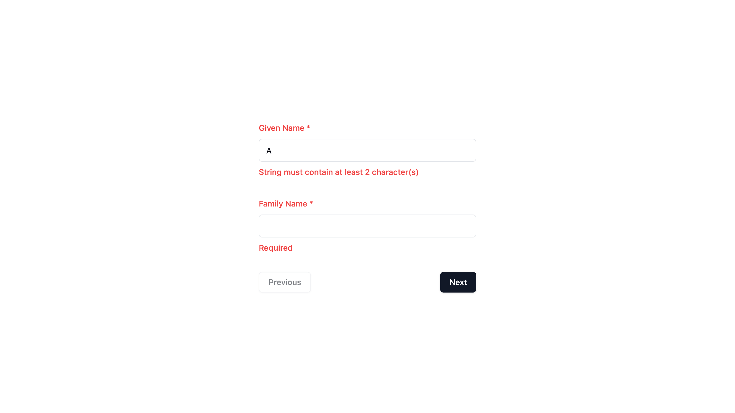
Validation Error
If a validation error occurs, the associated error message is shown under the field. The color of both the field label and error message is set to text-red-500.
See the Zod.dev docs for instructions on how to provide custom error messages.
Navigation to the next step in the wizard is prevented when there is a validation error on the current step.

Step 2
The second form contains a Zod schema with one enum field (containing 2 values). As a result a select box is rendered containing 2 options.

Step 3
The last form contains a Zod schema with a number field. As a result, a number input is rendered by default.

Preview
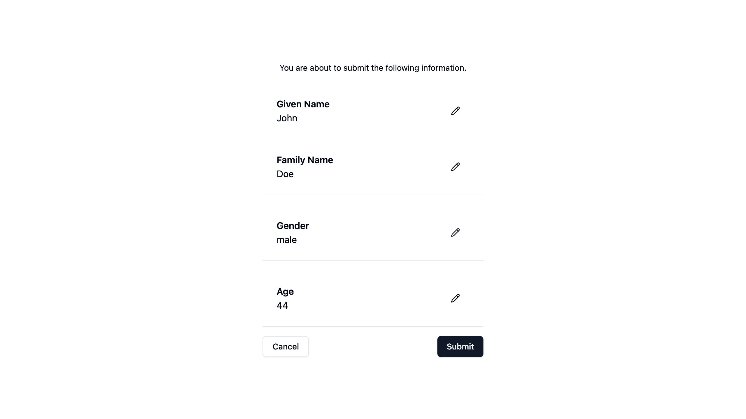
The following screenshot shows the list preview. Here the questions and answers are shown in a vertical list, with each form being separated by a divider.
Notice that the first two questions are grouped into a single section (with no divider between them). This is because this particular schema contains two fields in one form.

If the user clicks the Cancel button here, the form is completely reset, the answers are discarded and the user is sent back to the first step.
If the user clicks the Submit button, the completed event is emitted with the resulting data (key:value) (question:answer) pairs in its payload.
Edit
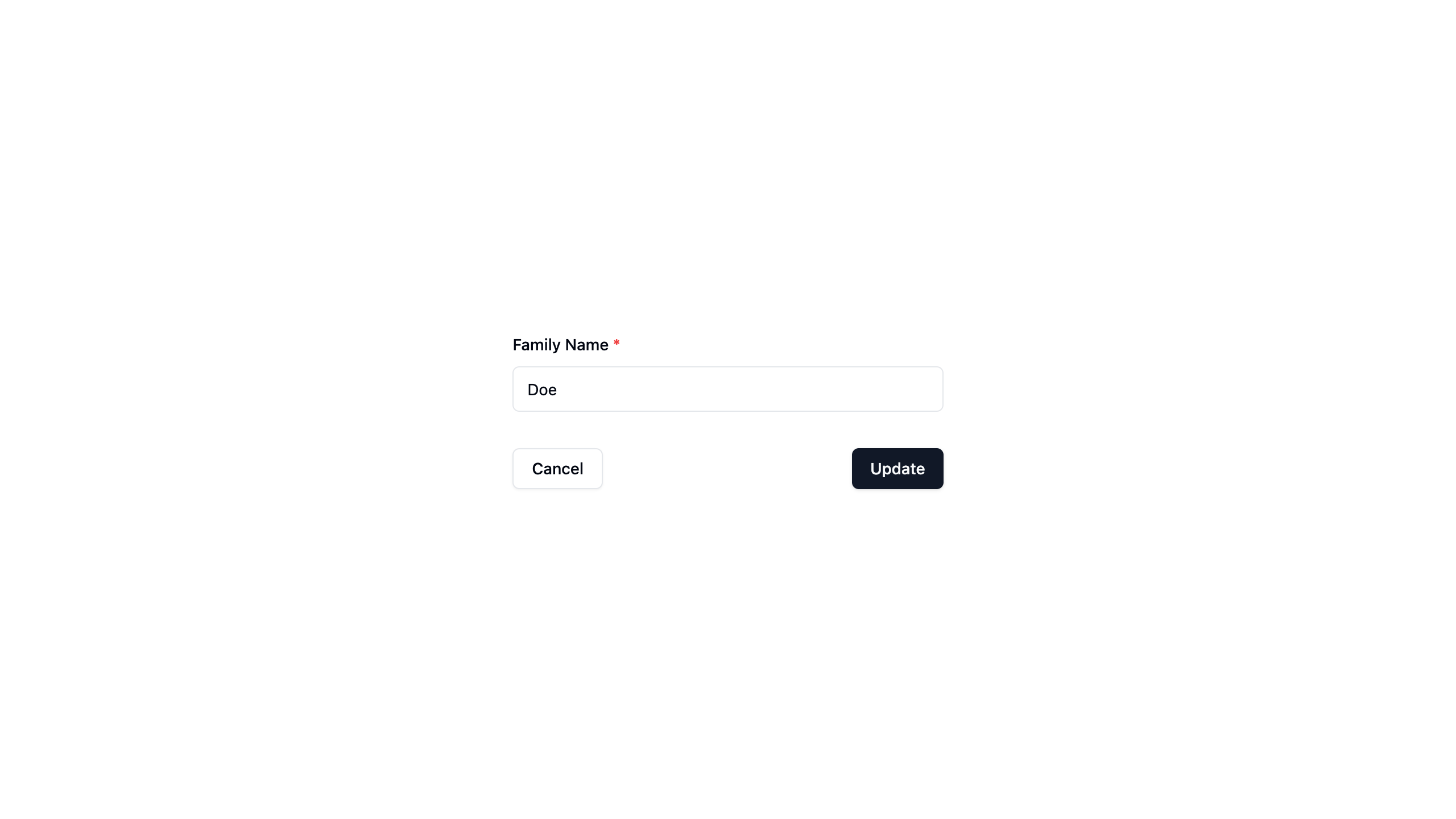
Clicking the pencil icon for any answer takes the user to the edit screen where a single form field (for that specific question) is presented to the user who can now edit their answer.
Clicking the Update button returns the user to the preview with the answer updated.

Resulting Data
The data payload available in the @completed event will contain the answers provided by the user.
So, for the above simple example you will receive an object like this for example:
{
  givenName: 'John',   // From Step 1
  familyName: 'Doe',   // From Step 1
  gender: 'male',      // From Step 2
  age: 44,             // From Step 3
}
It is up to you what you do with the collected data from there!
More Examples
Use the Examples menu in the sidebar to view more examples.